#for some reason tumblr is being finicky abt what @s will and wont add links so
Explore tagged Tumblr posts
Text
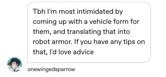
@onewingedsparrow I hope you have fun designing some OCs! I love seeing ppls tf OCs they’re always so fun and cool!
I’m no expert, but I do love character design so I hope you don’t mind if I over share just a little bit about my design process ahaha
TLDR: I like to think about personality, choose what shapes I want to use to convey said personality, and then mold the alt mode design to that rather than starting with the alt mode.
A small essay on tf and general design thoughts is under the cut though if you want examples and entirely too much detail
This is all entirely overkill u do not have to do this to have fun designing a cool character. This is just me dissecting how i micromanage my own design process bc I’m a massive nerd.
For a character design I usually start out by ironing out some of their key personality traits so that I can make sure to keep them in mind when I’m designing!
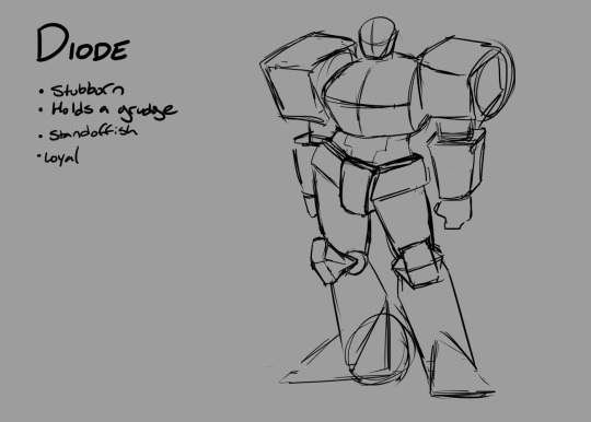
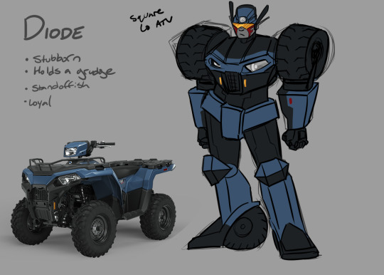
For this example I’m looking at Diode (seen above and below), she’s stubborn, loyal, and holds a grudge. A very steadfast, hard to move character. Because of this I want to make her feel very square and bulky. I want her to look like it would be hard to move her physically as well as mentally/emotionally. This also informs details that might be added later (ex. using a visor rather than eyes to indicate her standoffish nature).
This is the most important part of character design imo! You want the design to really showcase their personality so make sure their personality is solid!
I was mostly noodling for fun here, so I skipped a bunch of steps but I’ll just touch on them briefly here:
Research:
Normally if I was designing a comic character (a design I’d be drawing hundreds of times and want to be solid so i won’t want to change it half way thru the comic) I’d start out with research.
In the case of transformers OCs research would probably entail compiling a folder full of transformers designs. If you want your design to look functional, make sure to check out images of transforming toys in addition to designs from your favourite tf media. By doing this you’ll be able to take notes on what you do and don’t like about these designs, what ideas you might be able to incorporate to your own designs, and decide on what kind of style you might like to use or steal, how complex you want your design to be etc. Some people suggest making moodboards as well but I personally don’t love making moodboards so usually skip that step and just leave my refs in a folder i can refer to for personal projects ahaha
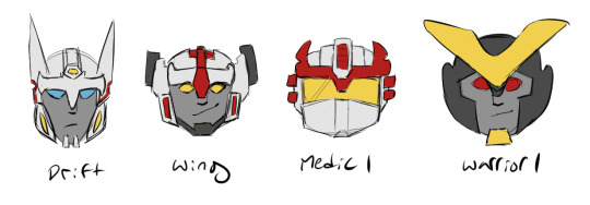
I did a little analysis of why all circle of light bots look the same (imo they should try harder to look different)

And here’s some doodles exploring how they can be shaken up to look different based on that research:
Depending on how familiar you are with human anatomy, research might also include looking up the human skeleton and musculature. I find thinking about how muscles and bones look and work (and then exaggerating them) extremely helpful for designing robots!

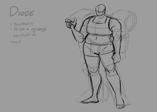
There was another post about designing robots i saw a bit ago by a person much smarter than me comparing mechanical joints to anatomical joints (and how those shapes might translate to a robot) so definitely check that out!
Sketches:
After your research, in theory it’s best to do some really quick low fidelity concept sketches to iron out what basic shapes and proportions you want to use for your character. I skipped that with Diode bc I just wanted to turn my brain off and figured I’d come back and do this step later. Most of the time i end up doing this step on paper just bc it’s easier to do wherever. Unfortunately it also means it’s easier to lose so I don’t have any examples.
The one sketch I did do is maybe a tad cleaner than I usually aim for? It’s important to be able to tell what the shapes are trying to do but you also want to be able to do a whole bunch of them really fast. Speed before quality in this case.

I usually do between 3 and 10 because I’m lazy and am drawing for fun but between 15 and 25 thumbnail sketches is closer to what I do for designs I want to be more polished and solid (like for comics). Sometimes it takes more than that to get it right tho. I designed a table for my grandma for Christmas last year and I did over 90 sketches before I landed on a design I was happy with (yikes!). Of course, this step isn’t necessary if you don’t mind your design evolving each time you draw your character but. you know. It’s an option!
Silhouettes are also a lot of fun to do if you’re making a cast of characters tho! I find them useful regardless, but they can be a really fun way to make your characters stand out from canon characters and from each other!
Here’s some silhouettes I did when @autothotsrollout just got me into tfp and we were tossing around the idea of rewriting exodus/exiles:
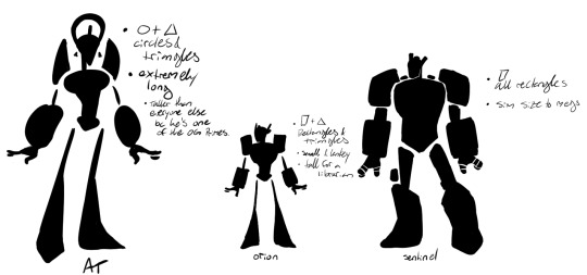
And here’s some silhouettes I did analyzing the drift mini series bc all the circle of light dudes look the same and I wanted them all to have different body types lol:

Details and Colour Studies
After getting the general shapes, adding the details is a lot easier! I usually make a base “doll” that I can “dress up” with different clothing or different iterations of mechanical details in the case of transformers.
Finding a real life car/boat/plane etc to steal details off wholesale makes life 1000x easier I highly reccomend it. You could even frankenstein a couple different types of cars together to get a cool alt mode and a cool robot design! This is also where a lot of the research from eariler comes in handy. If you’re designing with a TFP lean, most robots tend to have their wheels in their feet/legs and either as a joint (shoulder or elbow) or rescue bots all have their cabs/windshields as their chests etc! Steal solutions shamelessly.
@autothotsrollout said it really well: “If you can figure out where the front of the car is, where the wheels go, and if they have wings where their wings go then you can usually just fudge it from there!”
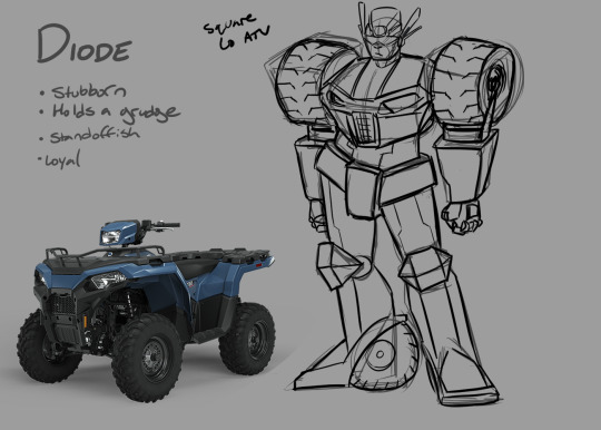
Digitally that can be done by just copying and pasting a lower opacity sketch layer, but it can also be done traditionally by making your own lightbox!
If you draw your doll on a piece of paper, you can put your phone flashlight (or other bright light) under a glass casserole dish or large see-through tupperware container, and use the light to see your doll drawing while drawing on a seperate piece of paper. or if your shapes are really distinct you can just redraw them each time. But the lightbox is pretty nifty and can definitely save you some time!
once you’ve got a design or two that you like you can test out colours to see what you like and voila! You have a polished and finished character design!
Here’s two of the colour studies I managed to salvage (I am a fool and destructively edit/save things all the time) of my OC Wish!:
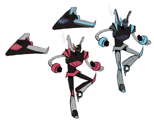
And here’s the colours I did for Diode!

I probably won’t stick with these colours, but I haven’t done a lot of transformer design before so i just colour grabbed from the reference it this was a lot of fun!
#optimist.txt#my art#long post.#character design is my passion ✨#thank u for enabling me to ramble about design slkdjfhg#for some reason tumblr is being finicky abt what @s will and wont add links so?????
304 notes
·
View notes